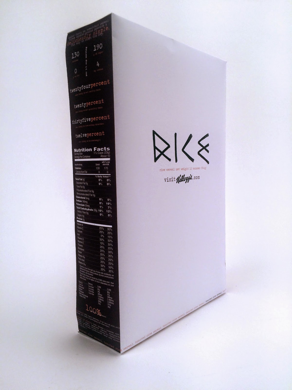
The Chosen One: Refinement is represented in this cereal box, with a focus of vertical lines and simplicity. Every piece seems as if it is in its place as it looks very clean cut. The start of the process of this design I wanted it to be extremely simple yet organic in a way. After the first mockup of the box I realized it would be interesting to design it as if you honestly could not tell the front from the back. It looks as if it was a misprint, something you would never find on a grocery shelf which was my intention. The color choice was to play off some of the organic feel to the box yet keep it focus on the black and white with only hints of color.
Energy was easily expressed with handwriting and the variation of scale. I challenged the hierarchy by flipping the text upside down besides the white kellogg logo that stands apart. The variation of the intensity and darkness of the type also gives it a vibrant visual 3-D feel. I kept the color palette minimal to keep the focus on the expressiveness of the letters on the front.
Confidence jumps out of the third box as the front feels as if it is coming out at you because of the angled approach on the typography. The boldness of the color scheme also shouts look at me, along with my choice to keep the text all caps. In the process I first took images of the text and barcode from angles to look as if it can not appear flat on the box. Eventually I decided distorting the text would also do the trick.


No comments:
Post a Comment