Showing posts with label gretchen raguse. Show all posts

Tuesday, May 5, 2015

Gretchen Raguse P2 Final Deliverables

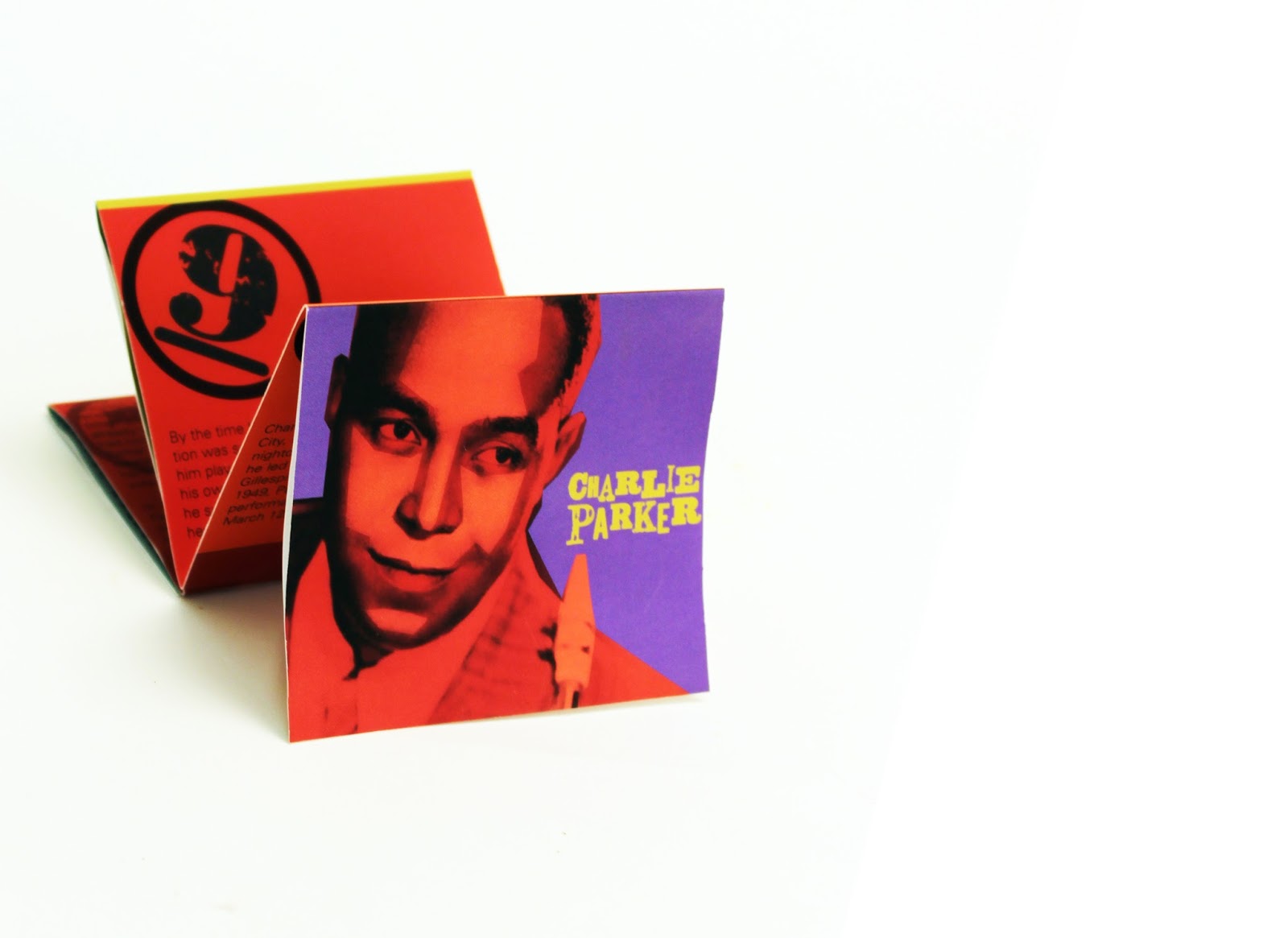
For my spacial experience, showcasing the life and stylings of Bebop jazz musician and creator, Charlie Parker, I chose to tie biographical elements in with visual depictions of jazz. When you enter the space, the bold and bright walls surround you and immediately the floor begins to rise, taking you on a symbolic journey through history. As you move through the space, the elevation of the floor directly represents his timeline throughout his life, rising to fame and eventually falling to the deathly effects of drug use. This movement through elevation also symbolizes the changing beats in bebop, and this sentiment is again suggested in the walls, as they are layered and chaotic, symbolizing Parker's style of music as well as his character by utilizing bird motifs. An interesting aspect to note is the number floor sections. Each new level is color coded and numbered to coincide with biographical information found in the booklet. These booklets are ideally placed along the right wall as you enter, meant to be used to help navigate you through the space.

The three words that inspired me were: chaotic, vibrant and movement.

EXHIBIT FLAT FILES


THE 3D FORM


BOOKLET


Tuesday, April 14, 2015

Gretchen Raguse: Final Boxes

For our first project with Prof. Kidwell, our task was to create a cereal box that signified a certain emotion. We were to use type as image and create a certain feeling within our typographic designs from a list of potential words written by "the client". After much experimenting, playing with different mediums and challenging myself to think outside the box–pun intended–I narrowed it down to three boxes. From there it was narrowing it down to one and deciding which design best achieved the goals of the project.

These are my final three boxes. In order from left to right, they represent  comfort, energy and order.

The box I decided on for the "client" was the one in front here that represents energy. Its bright colors, intense contrast and interesting hand type make it the most successful out of the three.


This shot shows energy because the customer quickly grabs it, the electric colors drawing him in.
This shot of the back of the box and the next shot of the front show energy because the photo is taken at such an angle that the box feels like it's rising up or growing from the ground.

This photo shows that same concept above but more exaggerated. 


This contextual photo sets the scene for the product and its purpose.

This box is simple yet strong and this ending shot perfectly captures that fact, with the wooden platform contrasting nicely against the lime green box and the simplistic white background and bowl keeping the composition clean.