Showing posts with label amelia. Show all posts

Tuesday, May 5, 2015

P2 Final - Amelia Hernandez


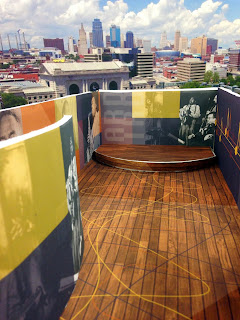
 This is my visual representation of what Bebop and Charlie Parker music sounds like. Somethings I kept in mind while designing was how the space would look in downtown Kansas City. I wanted it to blend in with the great atmosphere but also stand out. I chose a warm color pallet and wooden floors to provide a vibrant, jazz feel.

Throughout the space visitors would see Charlie Parker in his glory days. Although he lived a short life due to addiction, I wanted to represent the positivity he brought to Jazz music. He altered the way which way it could be played and how it sounded. I represented this through out my box with the fluidity of color schemes, opaque triangles that guide a viewers eye and font choice. 

On the exterior of my box I wanted to hint at what was happening on the inside with out giving it away. I chose to use simplicity on the exterior to do so.


 Spatial Photos


Informational Pamphlet


Tuesday, April 14, 2015

Amelia Hernandez-Final Boxes

 This specific box is to represent order. The communication of this piece expresses order by the organization of information. The use of blue, black and white colors was to keep the box "krisp"and clean. Hierarchy is represented with the various sizes of text and also written in blue. I kept everything flushed left to keep unity throughout each side of the box. 


detailed abstract shot of box 1
 For my second box, I wanted to represent comfort. I used a subtle/under toned/ relaxing sage green and clean white hand lettering to give the box a "homey" feel. Keeping the box unified throughout was something I kept in mind. I wanted hand lettering on the front but I wanted to make it different from my other box by not using the RICE KRISPIES name only on the front so I pulled from the other information. Using hand lettering and a comfortable serif, with the addition of the calming sage green I feel this box represent comfort very nicely. 


detailed abstract shot of box 2

 For my third and final box, I believe it is pretty clear that this box represents energy. I used contrast between the red and the indigo to make the red very vibrant. I also used contrast with the hand lettering and typeface of choice. Behind the content is the barcode: which can be scanned at any angle on the box. Content of this box is highlighted between two bright red rectangle on either side of the box which guides the viewers eyes into the middle of the box. From every angle this box is bright, vibrant and exhumes energy. 


detailed shot of box 3