Showing posts with label lizknochelmann. Show all posts

Tuesday, May 5, 2015

Liz Knochelmann P2 Final

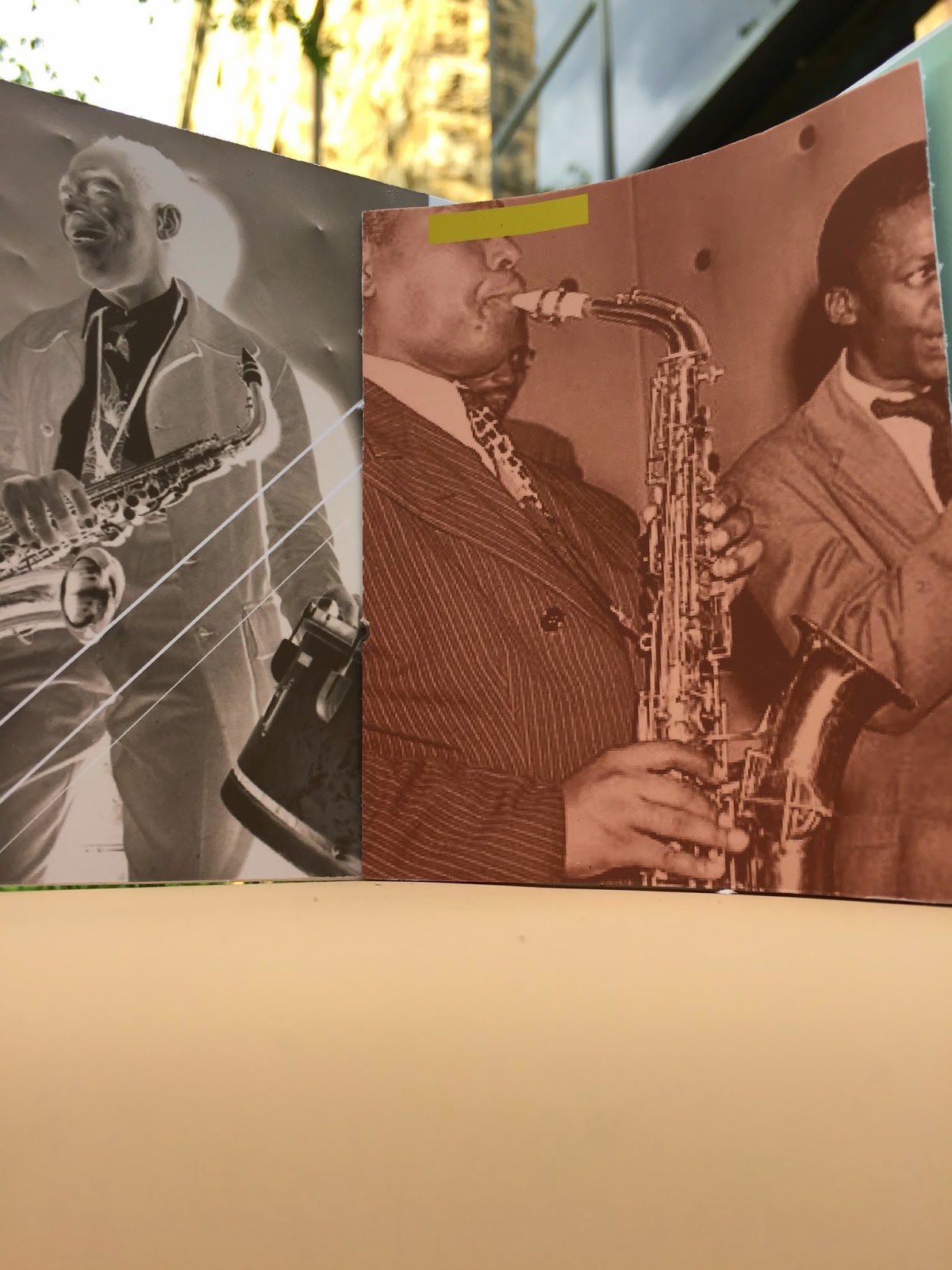
The ornithology exhibit, the life of Charlie Parker, is a reflection on both Bebop Music and Charlie himself. This shipping container illustrates the both the complexity and the beauty of jazz music as well as incorporating the tragic and sometimes hidden life of Charlie Parker. The piece, or booklet, that viewers will receive upon entering the museum, was inspired by Charlie's dark history, his addictions in particular. There are colored bars across Charlie's face as well as images of Charlie appearing inverted to emphasis the layer of Charlie that was not always seen, but always present. The bars are intended to hide his identity as a drug addict and try to replace these facts with colorful statements of how influential he was to Bebop. 
Three words that describe the overall experience of the space would be as follows. 
1. comfort 
2. confusion 
3. intoxicated 


Tuesday, April 14, 2015

Liz Knochelmann P1 Final

For this project the assignment of a word was designated for each box. I chose energy, confidence and informational. The pink gridded box convey's energy with it's bright colors and intertwining handwritten type and computer generated text. The idea shows energy through the grid and proves that through the organization of letterforms the energy is conveyed neatly. 

The second box, the pale blue and yellow, convey's information. This simplistic but chaotic form tricks the mind into believing that the information you are to absorb comes from the front. This is purely to then draw attention to the structure of the information on the back and allow the reader a seamless transition from point to point. This is the box that I would propose to a client. I feel this box is the most unconventional and non-cereal box like, but that's what I love about it. 

The third box, convey's confidence. The way that the dark blue/black form has woven type and a gradient of typeface sizes the box itches for attention, therefore exuding confidence. The box, though simplistic on the front, shows its confidence through the changing paragraph forms and the vertical type. 


The detailed shots of this box show the small copy and how the reader could potential decipher the text on the front, but then move to the back of the box to see the type in an orderly fashion and informationally laid out.